Ford Motor Company’s slogan, Built Ford Tough, has been the words behind the brand since 1979. Those three words are more than just a slogan though, it’s what Ford is all about. Those words are what have kept customers loyal to this brand since its inception in the early 1900s because whenever you choose a Ford vehicle, you are choosing a vehicle that was built tough.
Just like Ford’s motto has helped to convey what Ford is all about, the brand’s logo has done the same thing. Even if you have owned a Toyota, Honda, or even a Tesla before, chances are, you know about Ford.
Ford has been a staple in the American automobile industry since its first car was sold in 1903. With this first car sale, came Ford’s first logo. Are you interested in learning more about this iconic car brand and its logo that was built to last? If so, you’ll want to keep reading below.
Meet Ford
If you have ever driven a car, rode in a car, or embarked on a car search, a Ford automobile is likely a car you’ve come across before. Whatever your relationship with Ford is going into this article, here’s a brief introduction to the brand to get you reacquainted (or newly acquainted) with the Ford brand.

Ford was formally founded in 1903 once Ford Motors became incorporated and the first Ford vehicle was sold, however, the idea for Ford came years before that. Henry Ford first became interested in designing vehicles back in 1896.
His tinkering around with different vehicles led him to design his first automobile which was sold in 1903. The brand has continuously developed highly sought-after automobiles from the classic Ford Mustang to the popular Ford Explorer and the F-150 truck, to the beloved sedan models like the Ford Fusion and Ford Focus. Even after Henry died in 1947, Ford has remained in the family.
His family still owns the car brand, and they still possess 40% of voting power for Ford decisions. Today, the vehicles are manufactured across the world. While primary production still happens in America, Ford has expanded overseas with production plants across Asia and Europe.
The Evolution of Ford
1896-1903: From idea to conception
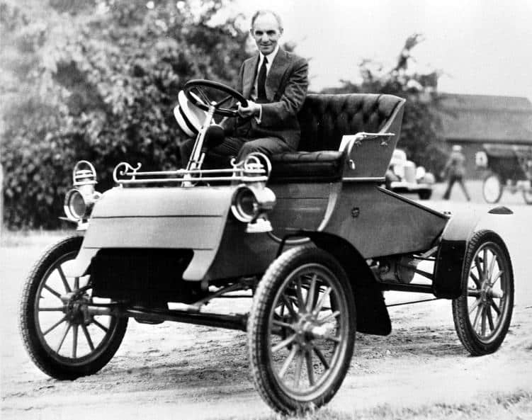
Henry Ford had an early interest in the vehicle industry. The first vehicle he constructed was in 1896 and this was a quadricycle, that was powered by a four-horsepower engine.
This early invention allowed Henry to first become acquainted with how an engine can propel a vehicle forward. From there, Henry worked at the Detroit Automobile Company for a year before deciding to create automobiles on his own, away from this company.
He crafted a faster vehicle than his first creation, a 26-horsepower car that beat out the fastest racecar driver at the time, so Henry knew he was onto something. By 1903, Henry produced his first automobile for the public which sold that year. With this sale, Ford Motor Company was officially established and had an early profit that first year.
1904-1908: Ford quickly expands overseas
Henry did not waste any time on expanding operations. The year after his first car was sold, Henry set up a production plant across from Detroit, overseas in Ontario. This allowed Ford to sell automobiles in Canada, as well as across Britain (due to Canada’s British ties), which was what some of Ford’s competitors weren’t as quickly focused on. Four years later, in 1908, Ford was at it again, this time with a sales office in Paris. This helped Ford to market and sell his cars further across Europe.
1908-1918: A new wave of innovation is unleashed
As Ford was ramping up international sales fast, he was also focused on unveiling new automobiles and processes. In 1908, Ford first launched the Model T, a popular car choice among consumers. Almost a decade later, in 1917, Ford also launched its first truck option, the Model TT. Outside of car innovation, Ford also thought creatively about production.
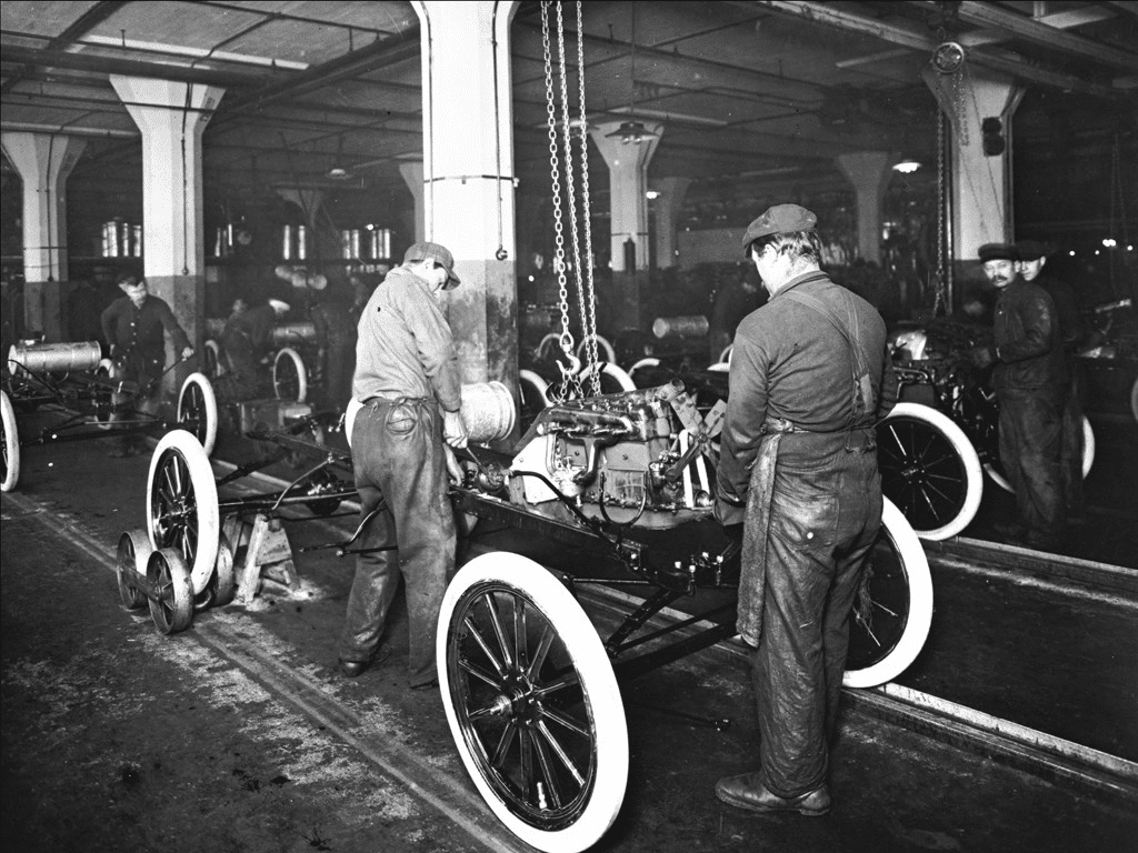
What Ford is often most credited with around production is its thoughtfulness with the company’s production assembly line. By transitioning to a “moving” assembly line, Ford was able to cut the production line time down by nearly 10 hours. This speedier production time was critical to Ford’s early profit success. Ford was essentially able to manufacture cars quicker, resulting in more sales.
1919-1938: Ford’s strategic direction progresses
With Henry’s son, Edsel Ford, becoming the next President of Ford, a new era of Ford was born. Instead of solely thinking about the speed and practicality of its cars, Edsel began to look critically at the appearance of the cars. One of Edsel’s first attempts at making more stylistic vehicles was the Model A in 1928. This car was unveiled to the public after Ford halted Model T operations and spent an entire 6 months focused on the construction of this updated model.
Another strategic move Edsel made was in 1922 when Ford Motor Company purchased Lincoln Motor Company. With this acquisition, Ford now was able to dip its toes into the luxury automobile market. A decade later, in 1932, Ford made another move.
To remain a strong competitor in the automobile industry, Ford constructed a new flathead engine that was a first for the American car industry. Even though Ford was in the luxury and lower-priced markets, Ford wasn’t in the middle-priced market until 1938. During this year, Ford revealed the Mercury car brand which consisted of all medium-priced vehicles.
1945-1964: Ford unveils another round of new vehicles
After Edsel passed away, and after Henry returned to a brief leadership stint, Henry Ford II, Henry’s grandson, became the new President of Ford in 1945. His grandfather passed away in 1947 and with Henry’s leadership, a new series of Ford automobiles were released to the public.
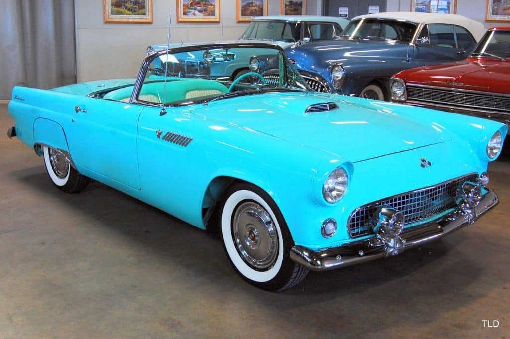
In 1948 the F-Series truck was first released to the public, followed by an updated standard car design in 1949. A few years later in 1954, the Thunderbird was launched to the public as well. Nearly a decade later, the iconic Ford Mustang was first available to purchase and was immediately widely loved by Ford customers across the world.
1954-1956: Ford continues to solidify itself as the industry standard
1954 was big for Ford besides being the year the Thunderbird was released. It was also the year that Ford first began crash testing its automobiles and Ford began to set this standard across the industry. In 1956, Ford generated enough success to enter the stock market with an IPO.
1960s-Today: Ford remains a leader in the automobile industry

While some automobile manufacturers slow down their innovation efforts and production, that was never the case with Ford.
Ford has continued to produce vehicles across the Ford and Lincoln lines (the Mercury line was halted in 2011), has been an early adapter to hybrid and electric vehicles, and has continued to explore partnerships and expansion of overseas operations.
In the last few years, Ford has displayed this innovative spirit yet again with the re-release of the Ford Bronco and by announcing plans for an entirely electric, F-150 lightning truck.
Roadblocks Along the Way
With any car manufacturer, the battle often becomes centered on staying relevant. With so many competing car manufacturers, it can be easy to see your brand suffer. For Ford, the focus was always to stay ahead of this.
Whether it was implementing new safety regulations, introducing new safety measures, adapting to sustainable vehicles, or being attuned to what Ford’s customers wanted, Ford was able to see profits remain steady over the years.
The Meaning of the Ford’s Logo and Ford’s Logo History
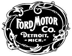
1903-1907: The first version of the Ford logo
When the first Ford car was purchased, and once the company was incorporated, the brand needed a logo that could accompany the brand name. This first iteration was intricate. The logo displayed the Ford wordmark boldly, stuck to black and white, and featured where the brand was founded, in Detroit, Michigan. While these details don’t seem intricate, the intricacy of the design was incorporated with the border. The border was an elegant mixture of delicate leaf designs and curled lines, making this emblem seem almost too complex and delicate for a mass-produced car brand.

1907-1909: The second version of the Ford logo
This logo design was entirely different than the first iteration. This logo stuck out more due to its bolder features. This design looked like an emblem that could easily be printed on automobiles. The focal point of this design was the Ford wordmark. The logo featured a series of other words that apply to the brand, but your eye still went to the Ford name first. The logo remained a simple color scheme except instead of white, grey was used.

1909-1912: The third version of the Ford logo
For this iteration, Ford went back to its roots. Rather than the bold, block lettering in the prior design, Ford incorporated Henry Ford’s handwriting. The Ford wordmark was updated to this handwriting. This design also removed any extra elements to the design and focused on the font and the wordmark. A few years later, in 1911, Ford added an oval border around the wordmark with the words, “The Famous Motor Cars.” This logo stood out from competitors and identified the Ford brand.

1912-1917: The fourth version of the Ford logo
In 1912, Ford designed to fine-tune its logo again. This time, the wordmark remained, however, the border and accompanying words were switched out. The background was now reminiscent of a bird’s wings and blue was first introduced. The accompanying words now read “The Universal Car,” and all the words were printed in white, making blue and white the official colors of the brand at the time.

1917-1927: The fifth version of the Ford logo
After trying out a new symbol, Ford returned to the oval border, removing the wing shape. Ford also removed the extra words and colors and focused on the simple wordmark, which sat in an oval. The colors used for this design returned to black and white.

1927-1957: The sixth version of the Ford logo
After 10 years of using the past logo iteration, Ford decided to incorporate color yet again. The logo remained the same as the fifth version, except now the design was blue and white. To accentuate the oval the wordmark sat in, a thin white border was added to the outside of the oval.

1957-1961: The seventh version of the Ford logo
Rather than redesign the logo altogether, Ford kept the wordmark on the sign and instead played around with the existing logo. The blue hue became more muted, the wordmark became bolder, and the oval became rounder in the middle.

1961-1965: The eighth version of the Ford logo
Another small update to the design came in 1961. The shade of blue was updated again, the oval returned to its original shape, and the border consisted of two white lines, rather than one.

1965-1976: The ninth version of the Ford logo
This logo iteration only featured minimal updates yet again. The double line around the border was reduced to one, the blue hue became brighter, and the font was condensed, rather than remaining elongated, making it more legible.

1976-Today: The tenth version of the Ford logo
Now that Ford had a logo design that the public responded positively towards, they made one final update to the design. This logo iteration that was unveiled in 1976 has remained part of the brand today. This 3-D design incorporated blue, white, and silver, as well as gloss features that help customers to visualize the design on a poster, commercial, and the vehicles themselves. A final update to this logo design that is worth noting is Ford’s use of gradient coloring. The use of shading in this design helps to bring the logo to life even more.
Ford’s logo font:
Some form of the current Ford logo font has been with the brand since 1909. This font is unique to Ford and inspired by Ford’s founder, Henry Ford’s handwriting. By using the founder’s font for the logo, the logo is deeply personal to the brand.
Ford’s logo color:

Instead of trying out a variety of colors, Ford stayed consistent with blue, white, and silver. White symbolizes the purity and freshness of the Ford brand, while blue symbolizes friendliness, reliability, and trust. The later addition of silver symbolizes Ford’s focus on inspiration and the metal that is used for the cars, which is built tough to last.
Ford’s logo symbols:
Rather than using a symbol in the logo design, Ford relied on its emblem to serve as the symbol. This design has become the symbol of Ford and is what we all think of when we think of what Ford’s symbol is.
Ford Today
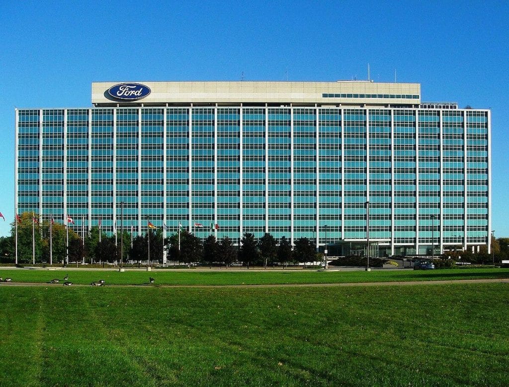
While some companies shift ownership after the founder passes, Ford has remained in the family. Beyond the family keeping 40% voting power, the other shareholders of the brand are Vanguard and Evercore Wealth Management.
Ford is still focused on innovation, just like the brand was during its early days. Led by Jim Farley now, Ford is currently working on releasing an entirely electric truck series and the brand recently reintroduced its widely popular Bronco series. Ford’s headquarters remain where the company was founded, outside Detroit in Dearborn, Michigan, and today, Ford employs more than 170,000 people across the world.
Lessons Learned from Ford
As you look at the evolution of the Ford logo design, one theme is constant – simplicity. The logo design focuses on the wordmark of the brand name, without overcomplicating it. The wordmark sits in an oval with subtle coloring, causing your eye to focus on the Ford name.
If the logo featured a variety of other elements, like the first iteration, your eyes would be overwhelmed and not know where to focus. Along with simplicity, Ford focuses on keeping the logo personal to the brand. By using the handwriting of Ford’s founder, Ford can’t get any more sentimental and personal than this.
Check out these awesome Logo Contests run on Hatchwise:


