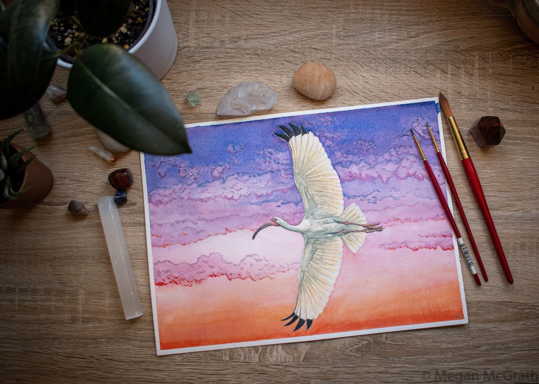
Wanted to share my latest piece with you all! My dear friend Sarah approached me last month to commission this painting of an American white ibis (Eudocimus albus). She’s from Miami, and wanted a painting of this bird that feels so emblematic of home. Have you been to Florida? There are so many beautiful stilt-legged waterbirds there!
I thought it would be fun to go into the process of making this painting from start to finish, including some of my own process for overcoming impostor syndrome and the fear that usually accompanies creating something. Are you an artist trying to figure out how to paint the natural world? Stuck in your own creative process and looking for inspiration? Or maybe you’re just curious about how this kind of thing is made? If so, read on!
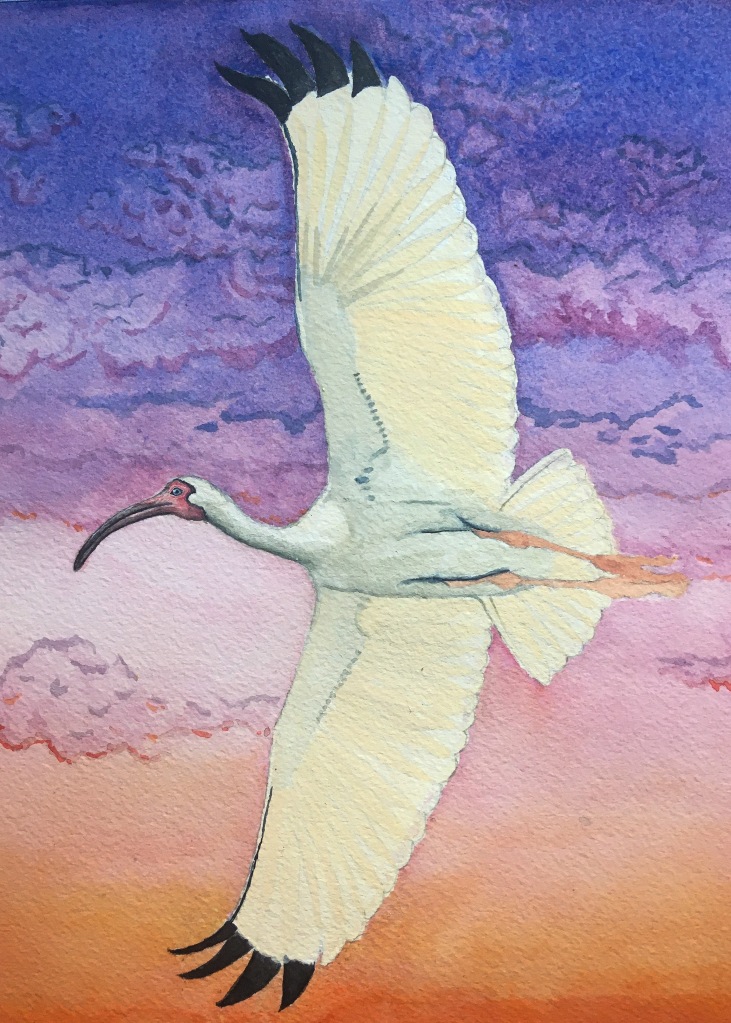
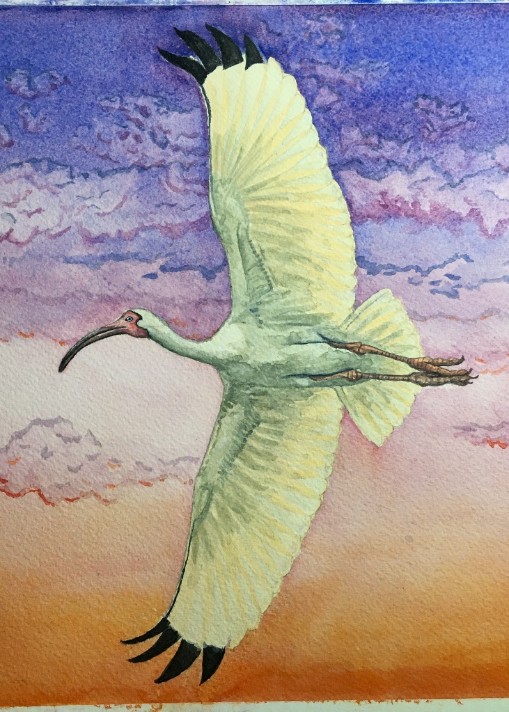
First, here are some more detailed images of the piece, which is a 9″x12″ watercolor:

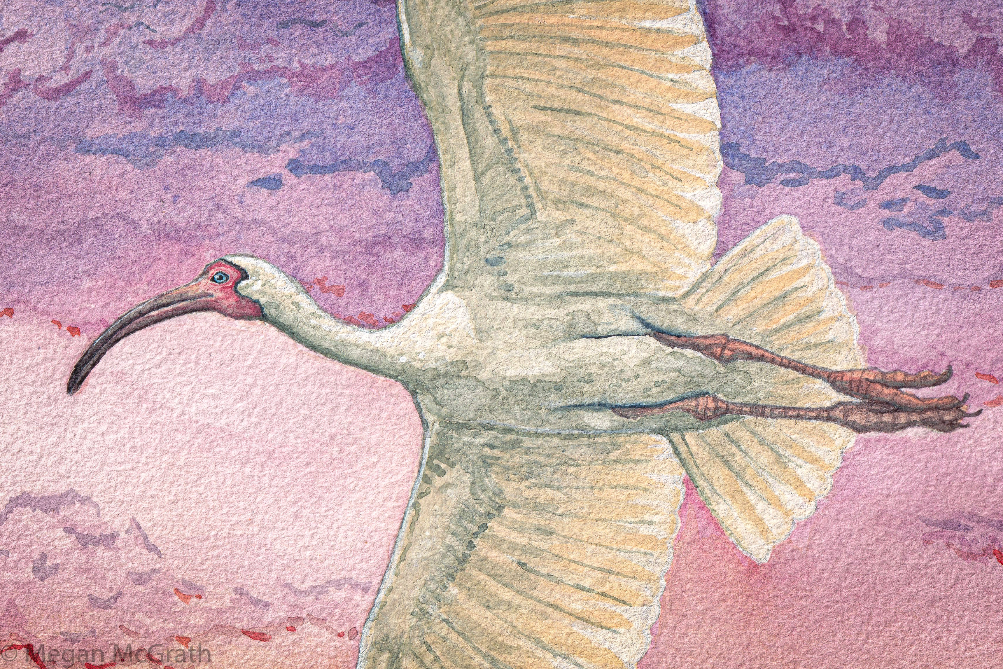
And some zooms for detail (click to view):

Read on for an in-depth tutorial on how I made this painting! Here are some quick links if you want to jump around to specific sections:
i. Planning
ii. Sketching
iii. Studies
iv. The Background
v. The Bird
Let’s get started!
i. Planning
Finding reference image(s)
My client Sarah and her partner Kevin approached me because they just moved into their first apartment together and needed some pieces to fill the wall in their main living space. I love their apartment—it’s bright and sunny, full of plants and retro movie posters. They thought a set of two paintings with birds that represented their hometowns would be a nice addition to the wall above their dining table. Sarah, who is from Miami, feels affinity for the American white ibis which is a common waterbird in Florida.

I immediately thought that painting this beautiful snow-white bird in flight would provide a lot more visual interest than it standing or wading, because even though the bird is white the textures of flight-feathers would produce a complex interplay of light and shadow. Sarah liked the idea, so I found this perfect free-use reference image by the amazing wildlife photographer Charles Sharp. A project like this needs a single high-quality reference; when working on simpler forms, I often will use 5 or 6 references to cobble a single bird together, inventing as I go. But a birds’ wing is such a multifaceted form that I knew I wouldn’t be able to make up the shadow patterns this time, and as you can see I hewed to this reference closely. Thank you, Charles!
Meeting The Fear
Sarah also intimated that she’d like the bird to be flying across a background that evoked a classic South Florida sunset. When she first suggested this, I immediately broke out in a cold sweat, but I know well enough by now to never show weakness in a planning discussion with a client! You see, every creative person fights on a daily basis with an obstacle that I will call The Fear. The Fear is the cold, clammy chill of self-doubt and impending disaster that tries to overtake you whenever you attempt to grow creatively. It is the Valley of the Shadow of Death that lies in the middle of every painting or creative project (I’ll get into this in more detail later). And it tends to rear its ugly head especially when some sainted angel has offered you money for your art; and even more so when that sainted angel happens to be a dear friend who you would probably walk over coals for. People who love you never actually ask you to walk over coals, but they will sometimes ask you to paint things for them, and you might be tempted to reply, “Wouldn’t you rather I walk over coals for you?” This is because of The Fear.
You see, I’d never painted a sunset before. Or any sky, really, or any landscape, or pretty much anything that is not an animal or plant. And here was my dear friend offering to pay me to paint her a sunset to remind her of home. The Fear coiled its cold snakey self in my belly and hissed, “You only know how to paint things with bodies. Any sky you try to paint will look like a blob. Blobs are not worth money. You are about to rob your dear friend blind.”
This is how it goes.
If you are a creative person, you know that The Fear is mostly lying, and that in order to succeed you can only listen to the part of it that is actually true and useful, which in this case was: I have never painted a sky before.
“So,” I said to The Fear, “I will learn to paint a sky.”
“You’re an idiot,” it replied.


Composition Planning
Meanwhile, now that I had a reference, I needed to consult Sarah to decide on the composition of the painting. I knew I wanted to work on my 9″x12″ Arches watercolor pad, but I wasn’t sure whether the bird would look better on a landscape- or portrait-oriented canvas. I used Sharpie marker to delineate a 3:4 aspect ratio space in my sketchbook, did two quick renderings of the reference photo, and sent them off to Sarah. We both thought the landscape setting, above, gave the bird more room to breathe.
With these basics figured out, my planning stage was over and I was free to move on to sketching and studies.
ii. Sketching
Every painting starts with a fairly detailed graphite sketch. While I’ve only been painting for about two years, I was a pretty dedicated life-studies artist as a teenager, so this is my most comfortable area and the place I am least likely to hear from The Fear.

Sketches happen in two general phases. The first is to block out general shapes, which you can see at left (above on mobile). I use a mechanical pencil with HB graphite for this, which for me is a hardness that is not so hard that it dents the paper, and not so soft that it leaves dark smudgy marks and is difficult to erase. Because that’s what this stage is about: Erasing.
In the stages of a drawing I erase as much as I draw, often depositing lots of lines for one stroke and erasing down to the one that looks right. An art teacher once told me that this is a flawed method of drawing—that one should be able to confidently and precisely mark down the intended line with one stroke—and forbade me from drawing this way. To which I say: Baloney! Art teachers can be such menaces. For me, making art is about joy and producing a product that’s lovable; find the process that gets you most easily to the things you love. This open, unfussy sketching process is like a conversation I’m having with the lines I’ve already drawn. When the right one gets drawn amidst many others, it sings, and I erase everything else.
Of course, erasing this much can wreak havoc on a cold-press watercolor paper surface, which is so beautifully textured. The right graphite (HB) and eraser (a kneaded one) helps prevent me from overworking the paper. This is also one reason among many I wanted to use my Arches watercolor pad; Arches paper is so expensive it sets my teeth on edge, but it really is great, and sturdy enough to hold up to rough treatment.
Once I have the general shapes, I fill in all the detail I’ll need to paint from:

This, crucially, is not just a drawing of an ibis. If I was leaving this as a graphite piece this sketch would look really different. Because it’s a guide for where paint will go, I paid most attention to the outlines of shapes and shadows, and left some smaller details—like the face and head—relatively undefined.
Once a sketch is finished, I will usually lighten it with the kneaded eraser using press-and-lift erasing—by pressing the eraser to the paper and lifting it off without rubbing to lighten the lines without disturbing them. The photo above was taken before this step, which is essential to get the sketch light enough that it won’t be fully obvious beneath the highly transparent watercolor. It was especially important in this case—I was trying to paint a white ibis, after all.
You’ll also notice that at this stage the edges of the paper were marked off with white artist’s tape. The tape would mostly be important when painting the background, as paint will not run beneath the tape, resulting in a crisp white edge once the tape is removed. I added it first thing before I started sketching, so that I could take it into account as a border for my composition.
iii. Studies
Now it was time to face The Fear: I had to learn to paint a South Florida sunset in watercolor, having never attempted to paint a sky before.
If you’re a person who’s subject to The Fear (and if you say you’re not, I honestly don’t believe you), you’ll know that it presents itself during nearly every project, but that conversations with it are more manageable in some pursuits than in others. For example, my Fear when I was a grad student was so mean and powerful that it was like a boa constrictor wrapped around my neck: It took me years to finish projects, and I couldn’t breathe the whole time. But for whatever reason, my Fear is more personable when we’re working on visual arts. It’s still an annoying and abusive snake, but it’s more of a two-sided conversation, and I find myself more able to solve problems. This is probably due in part to the fact that in art I am mostly self-taught, and there are literally no rules.
In this case, I needed to teach myself to paint a sky quickly enough that I could eventually turn this piece around, and beautifully enough that I could do justice to my dear friend’s vision and generosity.
I did this in three steps:
- Learn: I watched a ton of Youtube videos of people painting skies.
- Plan: I looked at a lot of Miami sunset photos to plan colors and strategy.
- Study: I painted a sky study apart from my ibis painting as a kind of trial run.
The first is how I learn pretty much any new art technique. There is so much free content on Youtube made by brilliant creators it’s mind-boggling. If you’re passable at monkey-see, monkey-do imitation, once you’ve watched a bunch of art Youtube you’ll find that making pretty much anything is way easier than you might have thought. (My favorite, if you’re curious, is probably Mind of Watercolor.)
The second was easy: Google is great. I also happen to have an aunt who lives in South Florida who sent me a bunch of sunset photos from her neighborhood. Comparing Miami sunsets with other sunset photos taken across the US, you begin to see that Miami is characterized by what you might think of as the classic vaporwave colors: Deep violet blues transitioning into vibrant fuchsia. In painting this sunset my most important color would have to be pink.
The third was the real trial. I ended up doing two studies, trying to paint something that read as a sunset. The first was such a vomitrocious rainbow mess that I will not be showing it to you, sorry. The second looked like this:

Seasoned painters, I suspect, may look both at this and the completed painting and see them for the amateurish attempts that they are, especially since this sort of washy gradiented effect is what watercolor really excels at. But for a second try I thought this was perfectly good enough to be going on. Practice done, I moved back to the ibis painting to paint its sky.
iv. The Background
I apologize because when it comes to photos, this section of the walkthrough is a bit rest-of-the-fucking-owl-ish. This, again, I blame on The Fear. When a cold, mean snake who lives in your belly is continually hissing things like, “Cut that out! You’re going to ruin it! Why didn’t you go to med school when you had the chance?” at you, you may be seized by an instinct to skip documentation of your process lest it be used against you in a court of law. I can tell you that the background, when finished, looked like this:

And this is how I got there:
Apply masking fluid: I started by marking the boundaries of the ibis off with masking fluid, which is the shiny yellow border you can see in the photo. Masking fluid, when used correctly, can be a watercolorist’s best friend. It is some kind of awful nosehair-singing chemical the texture and appearance of very thick cream that can be applied to paper in thin lines and drops, and hardens tacky and dry within minutes. Since watercolor is so runny and chaotic, it provides hard borders that would otherwise be impossible to achieve. Once paint is dry, the masking fluid can be pulled off in runs; at this stage it is wildly elastic and pulls off the page like a rubber band. I do not want to think about how toxic or bad for the environment it is; it is very, very useful.
Make a gradient: Once the masking fluid was dried around the ibis, I applied a wash of my base fuchsia color (crimson + white paint) over the entire canvas in as even a layer as I could achieve with an inch-wide synthetic sable brush. Once this pink layer dried, I made two gradients: A wash of ultramarine blue diluting from the top, and a wash of orange-yellow diluting from the bottom of the canvas. I probably reinforced each of these layers twice, and at the bottom of the canvas I also added one final shorter gradient in orange-red.
Lift out clouds: When these gradients were freshly laid down and still wet, I used crumpled up tissues and paper towels to lift off the paint in spots, revealing the dry pink wash underneath. These gave me the beginnings of cloud shapes (along with some unevenness in the washes themselves resulting from the fact that I had no idea what I was doing).
Add highlights and shadows: Once I had the impressions of clouds, I kind of blacked out and went totally nuts adding details to those clouds. I reasoned that the undersides of the shapes would be warmer colored than their tops, because they are closer to the unseen blood-red sun at the horizon; likewise clouds nearer the bottom of the canvas would have warmer shadows and highlights than the clouds at the top. These conclusions informed my decisions about which colors I used where, but otherwise I went into flow and just added a bunch of squiggles everywhere. Flow is a bit of a manic state and is another reason why I don’t have photos of this process, sorry! I think the result, while not entirely realistic, reminds me a bit of a Bill Watterson tableau (see the top of this Calvin and Hobbes Sunday panel, for instance), and I love it.
With my first attempt at a watercolor background reasonably, blessedly successful, I was finally able to move on to
v. The Bird
Painting birds is well within my comfort zone—despite the name of my site, most of the art I’ve made in the past few years has been portraits of birds—but that doesn’t mean that painting them is free from negotiating with The Fear. It’s especially noisy right at the beginning, when you’re first covering up a carefully drawn sketch that you like with indiscriminate blobs of paint.
A good plan of attack will get you through the awkward first steps of any painting. Let’s take another look at the reference image by wildlife photographer Charles Sharp and review the basic watercolor process:
Planning
The #1 rule of watercolor painting is that you can’t go back from dark to light. The defining characteristic of the medium is a very high proportion of water in the paint, which makes the material runny and highly translucent, so dark areas show right through lighter paint. It’s a different process than painting in, say, oils, in which the medium is thick and opaque enough that both dark and light paint can successfully replace each other. In watercolor dark can replace light, but light can’t replace dark.
You might think this means you should paint from light to dark, but my favorite technique is actually to start at both ends of the spectrum and work my way in: Paint the lightest lights, then the darkest darks, and you will have a better idea about the boundaries of the reality you’re trying to build.
Looking at the reference again (above if you’re on your phone), you might notice that although this is a white bird (and your brain does read its coloration as “white”), there’s very little true white color in the image! It’s actually a riot of subtly different grays, some of them—especially on the body—quite dark. There’s a lot of complexity in the transition from light to dark on the undersides of those wings, and I knew getting that right would be the biggest challenge in this painting. But from the get-go, it’s easy to see that the lightest areas are the back of the neck where the sun is hitting, and the most translucent feather-tips on the trailing edges of the wings; and the darkest areas are the beak, the underside of the head and neck, the creases by the legs, and of course those black wing-tips.
There was one more challenge I wanted to take on, which was changing the overall color profile of the ibis to fit better into the sunset I’d already painted. You see, the reference image was taken in pretty neutral-colored light (or the photo was color-graded in post-processing to look that way), so that the lights and darks on the ibis look pretty much like true white, black, and the grays in between—there is some warmth (orange/yellow tones) in the highlights and coolness (blue/green tones) in the shadows, but it’s pretty subtle. Light during a sunset, though, is very different: highlights are quite warm/orange, and shadows by contrast appear cooler or more blue. (This is why we call sunset the “golden hour.”) Here’s an amazing image of the same species, an American white ibis, by user “Backdoctor” at Nikon Cafe to show you the difference:

Compared to the reference image, this ibis at sunset is much more yellow and blue. I knew that if I painted my ibis with simple grays mixed from black and white, the figure would look flat and out of place against the vibrant background (and besides, grays mixed from just black and white look flat in pretty much any circumstance—they don’t really exist in nature). Knowing I would probably change everything later, I made a lightest-color shade by mixing an orange-yellow paint with white, and a darkest-color shade out of Peyne’s grey (a dark blueish gray) and some white. In four additions I added increasing amounts of the Peyne’s grey mixture to the orange-white mixture, so that I had six colors in a gradient from the lightest creamy orange-white through some warm green-gray midtones to the darkest warm-green color. These became the basis for all the shades on the ibis’s body. I could use the reference image to inform my decisions about value and placement, while using a color palette that was more appropriate for a sunset scene.
Planning complete, I was ready to begin painting the bird.
Underpainting
Is underpainting the right word for this stage? I’m not sure, honestly; I’ve seen it more commonly applied in oil painting, for the first layer of paint that the artist applies all over the canvas to establish a midtone. But it’s how I think of the first step in my watercolor process: I establish blocks not of midtones, but of the lightest colors in the image.
This is the stage in which The Fear is at its loudest and most bitter, because, as you can see, it’s ugly as all hell:

Sorry about this awful, dark, blurry image; I was behaving like a furtive little goblin because at this stage The Fear leaves me with no faith that the painting will ever be good, and I’ve already invested all this time in a beautiful sunset and look how I ruined it with this kindergarten blotch-monster, “and besides,” The Fear hissed, “look how garish the colors are. You’re an awful painter and you have terrible taste?” So it goes.
There’s some good establishment here, though: All of the lightest colors in the ibis are laid down. The wing-tips, of course, are jet black because that’s as light as they get; the naked red head’s lightest color is a flesh pink; the legs have quite a dark orange because they’re pretty dark overall; and I’ve marked out the darkest parts of the body in a gray midtone.
At this point, though, I was feeling pretty stuck, mostly because The Fear was shrieking its snakey little head off. I hated the cartoonish orange of the legs, and the stark blank spaces around the wing-tips that the masking fluid had left. And looking at the reference image, the subtleties of shadow on the wings and body seemed almost impossibly complex; I just couldn’t make sense of them, and was hesitant to start lest I ruin the whole thing. I needed a confidence boost.
The Head

I knew that if I could figure out just one part of the bird, the rest of the painting would follow. Starting with greater detail on the head of any animal usually helps me a lot; there is often a single moment that is a turning point, when the animal goes from looking like a blob to something much more animate, almost alive. At this point, it often feels to me as if the animal itself begins talking back to The Fear for me; and the painting can begin to be more of a conversation between me and the painting, rather than me and The Fear. I know this is all very woo-woo, but I swear this is what the process of painting is like, at least for me. I would love to hear from other artists about whether they’ve had similar experiences!
This ibis was especially suited to focus in on the head alone, because the featherless face is so clearly delineated from the rest of the body. Because I had the flesh-toned underpainting (which you can still see on the finished head at left around the corners of the mouth), I next painted the darkest areas: the crease where the face meets feathers, the shadowy underside of the head, the beak’s gape line, the borders of the eye and the pupil. Then it was just a matter of filling in gradiented midtones: The dark grey of the beak fading into the pink of the face, the shadow up from the chin and the featherline, and the blue of the eye.
All of this, by the way, was done with an absurdly tiny 5/0 size synthetic sable brush; in real life, the head is probably not much more than an inch long.
The last part of any paint process, and my favorite, is the addition of highlights, for which I often use white gouache paint over my watercolor. Gouache is a similar medium to watercolor, but with a higher pigment to water ratio that makes it much more opaque. Remember how I told you that watercolor is a strict light to dark medium? Gouache allows you to break that rule and paint lights over darks. With my tiny brush I added some white gouache to the top of the beak, the lower beak around the gape line, to the creases around the eyes, and, crucially, as a highlight on the eyeball itself.
The moment when an animal painting gets that eye highlight is the moment that I say it “gains its soul.” I’m not sure why, but that little brightness on the eye does so much to make the figure look alive that it’s a big turning point in almost every painting. It goes from looking like a dead aggregation of color and form to looking like something that has a spirit, personality, and opinions of its own. It’s an infinitely reassuring moment every time, and if I manage to do it in the middle of a painting it’s a powerful argument against The Fear. It’s as if the figure begins to justify its own existence, and helps me do the work to make the rest of its body measure up to the promise of its living eye. Again, I would love to hear from anyone else who has had a similar experience with their art.
I thanked the ibis for restoring my faith in myself as a painter, and with confidence renewed I went back to its body.
The Body
With the lightest areas of the ibis’s body blocked in, I knew the next part of the work would involve establishing the darkest areas, and then chasing around the complex midtones in between until the painting was done.
At right, you can see that I’ve marked out the darkest areas of the body: the creases where the legs meet the body, the underside of the neck, and the darkest areas where the wings connect with the body. I also reinforced the very brightest areas with white gouache at back of the neck and the feathers at the trailing edge of the wings.
I found the midtone work in this piece really daunting, so I reasoned at first that a good start would be laying down a bright tone where two wing feathers overlapped, then a slightly darker shade where three feathers overlapped deeper into the wing, and so on. So I put down my lightest shade from the midtones I mixed earlier, that creamy orange, where all the feathers overlapped in the wings and tail. You can see on the upper wing that I began another layer of overlapping with a slightly darker, cooler shade, but I didn’t love this effect and thought it didn’t do justice to the reference. A bit stymied, I moved on to painting some of the finest dark details in the musculature of the wings, along the ibis’s “arms.”
Focusing on these details seemed immediately more productive; they made the anatomy start to feel really grounded. You might have learned in science class that bird wings are really just arms that have been adapted for flight; and also that birds are descended from dinosaurs. These little details instantly made the bird look stronger, more embodied, and more monstrous, and I leaned into fleshing them out so that when I returned to the more subtle color gradations I would have more of an idea of what I was doing.

Here’s a closeup with more of those bony arm details traced in. The reference showed a lot of forms that were really just dots and lines; I’m not sure whether this reflected the shapes of the feathers or the internal anatomy, but I love how sinewy and skeletal they look.
I also added detail and shading to the legs in a cool “burnt” brown, which toned down the cartoonish orange into something more realistic.
Between this photo at right (above on mobile) and the last I went on break for the holidays, and when I got back to the ibis I went into flow state and kind of blacked out again, forgetting to document in-between steps—so I understand if this shot is a bit rest-of-the-fucking-owl-ish, again. What happened in practice is that the break allowed me to see this painting with fresh eyes and finally get brave enough to blot in the midtones with a thicker brush than the 5/0 detailer I’d been using up until now.
As I described in the above, I’d already mixed up six shades to use as various midtones on the ibis’s body, but the added flexibility of watercolor is that the more water you have on your brush or in your mixture, the lighter the paint deposit is going to be. This allows you to dynamically lighten and darken your shades as needed, and also means that you can layer the same areas over and over to darken them slowly. It’s a little hard to explain since a lot of it is instinct in the moment, but hopefully you can see how I did this on the bird’s body, especially.
Once all those complex midtones were blocked in, all there was left to do was add a bit more detail. I added the dark shafts of the flight feathers; I strengthened the opacity of the trailing edge of the wing with white gouache; I filled in some areas of the background that the masking fluid left blank when I’d painted the sunset; and I added some extra highlights to the neck, head, shoulders, and to the leading edges of the black wing-tips to give them a touch more dimension. Let’s take another look at the finished product:
Thank you so much for joining me on this journey! I hope that you enjoyed the in-depth look at a painting process from start to finish. If you have any questions about nature art, or are curious about commissioning a painting, drawing, or tattoo, you can always email me at contact@mammal.fish, or find me on my Instagram or Facebook pages.
Cheers! -Megan


Words are completely inadequate to describe everything I love about this!
dr deborah bernstein warwick, new york (845) 986-6684
http://www.drdebbernstein.com http://www.debspots.com
>